The Form of Things to Come, Part 3 – Weeping Form

Until a day or two ago, it was feeling quite springy around here – longer days, mild daytime temperatures, and I’d begun the flurry of client interviews and site assessments that typify my spring schedule. Then BAM – old man winter returns with a big dump of the white stuff.  Lucky for you, this means a short reprieve from aforementioned activities, and I can work on this post. Next in the plant form series is weeping form.

Weeping Form

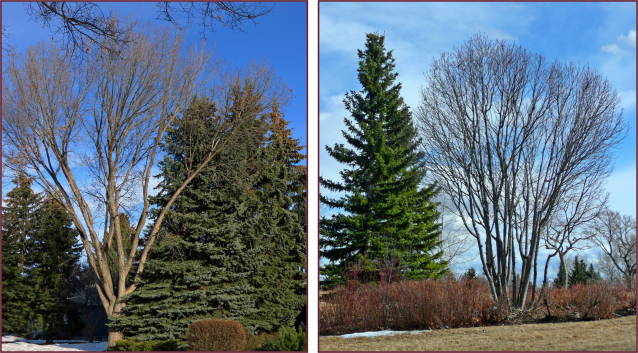
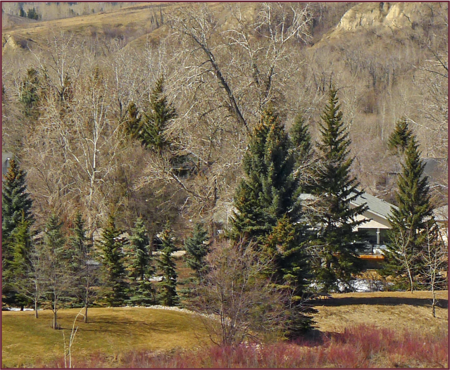
Weeping plants can be huge trees like Betula pendula ‘Laciniata’, or small grafted specimens like Betula pendula ‘Youngii’. The large weeping trees have less distinct form because there are countless branches, each with delicate drape – the resultant outline of form is therefore somewhat amorphous, though still quite elegant.

Weeping Birch

Large weeping trees like this weeping birch don’t exhibit a distinct outline – the weeping habit of their branches creates more textural interest, than well-defined form. Photo: Pat Gaviller

To me, they bring a sense of quiet luxuriance to a landscape, perhaps because I associate this form with the giant weeping willows that reside near still waters – the picture of both opulence and serenity.

Although these big weepers lack definitive form, their lacy texture makes them lovely feature trees – if scale and proportion allow. They are especially lovely as waterside accents and make elegant shade trees – again if the size of your house and/or property allows.

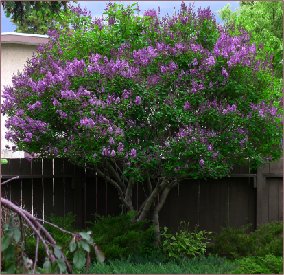
Small weeping trees offer much stronger architectural form than their larger counterparts– their arched weeping branches create an umbrella-like form. Many of the weeping specimens available at nurseries are actually low-growing creeping shrubs that have been grafted onto a standard, for example Young’s weeping birch, Walker’s weeping Caragana or Rosy Glo weeping crabapple.

This form draws the eye up … and back down again. It is strongly dominant so should always be used as a single specimen – I can’t stress this enough. Don’t try to group them in threes, or use two to frame an entry, or plant several in linear fashion – it just doesn’t work. I made the mistake of planting two in my front yard several years ago – you can read about it in my post from last year around this time: Form, Colour and Texture in the Winter Garden. The bottom line is, any more than one and they’ll just compete for dominance and create visual unrest. So one is enough – got it?

Malus Rosy Glo 3

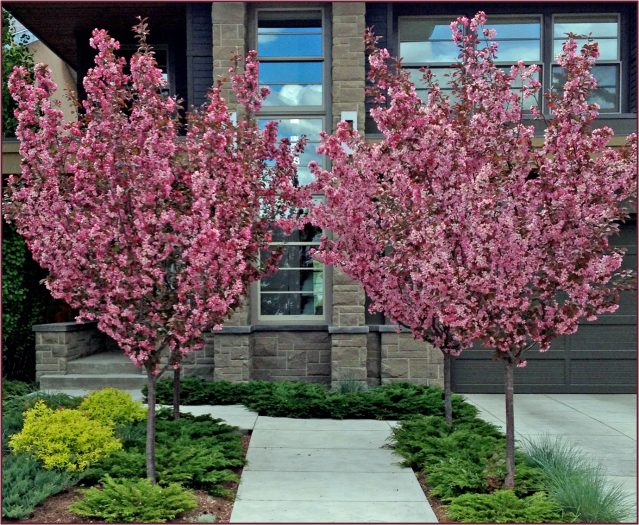
Malus ‘Rosy Glo’ makes a beautiful specimen tree as it looks spectacular any time of year – here I’ve underplanted with Juniperus sabina ‘Moor Dense’ which stages her nicely. Photos: Sue Gaviller

C. arborescens ‘Walker’s Weeping’

A weeping form makes a nice centrepiece for a symmetrical composition. Left – Caragana arborescens ‘Walker’s Weeping’ in a client’s raised planter. Right – another of those pretty scenes I periodically drive by, C. arborescens ‘Walker’s Weeping’ in winter still has strong form. Photos: Sue Gaviller

Weeping Caragana

Walker’s weeping Caragana: simple repetition of line makes this tidy scene one I often stop to admire. Photo: Sue Gaviller

These small weeping trees are useful for highlighting architectural details, like arched doorways or windows – the arching form of the branches mimic the architectural line, thus bringing attention to it, and creating unity (by repetition).

Fountains too, can be ‘echoed’ in this way with the placement of a weeping tree nearby.

As well, a weeping form looks very appealing at the top of, or near a slope – the weeping branches reiterate the sloping line of the hillside.

And don’t plant one of these feature trees in the middle of an expanse of lawn where it will appear lonely and insignificant – it’s much more effective when staged and supported by the presence of other plant material.

Weeping Norway Spruce

A fine-looking specimen, Picea abies ‘Pendula’ looks splendid in this sloped front yard garden in charming Elora, Ontario. Photo: Sue Gaviller

I’ve had several clients tell me they don’t like the shape of weeping trees because it makes them feel sad (maybe it’s the name – y’know power of suggestion and all). I don’t get this. To me weeping forms are graceful and very pleasing to the eye. Indeed their appropriate use demonstrates a mature design sensibility. I guess it’s a humble reminder for me, and all you aspiring designers, that there is a degree of subjectivity in design that must be acknowledged and respected. And with that little piece of wisdom my friends, I shall bid you adieu.

More “Fun with Forms” in my next post – see ya then.

Humbly yours,
Sue

© Sue Gaviller and Not Another Gardening Blog 2012.

Unauthorized use and/or duplication of this material without express and written permission from this blog’s author and/or owner is strictly prohibited. Excerpts and links may be used, provided that full and clear credit is given to Sue Gaviller and Not Another Gardening Blog with appropriate and specific direction to the original content.

The Form of Things to Come – Part 2

In my last post, I opened a discussion on plant form with a look at columnar or fastigiate forms and their use in the landscape. Today I continue this discussion with two additional forms – Pyramids and Vases.

Pyramidal/Conical

Pyramids or cones are wider at the bottom, becoming narrower and tapering to a point at the top. Their geometric form gives a garden solidity, structure and definition. In our climate, it is during the long winter months that pyramids carry the most visual weight – most of the pyramids we see are evergreens, which are dense, stiff needled and weighty in appearance. As well, pyramidal forms carry their weight close to the ground – this wide-bottomed shape means that visually they are very grounding (anyone else start silently singing the refrain from a certain song?)

Pine

A solid green pyramid, which I suspect is Pinus mugo ‘Tannenbaum’, stands out in this winter landscape, firmly anchoring the more yielding forms of leafless woodies and dried grasses. Photo: Sue Gaviller

Blue spruce and bench

The pyramidal form of blue spruce provides definition and structure to this pretty vignette.
Photo: Sue Gaviller

Pyramids can be quite variable in size and proportion – some are short and squat, some tall and narrow and some in between. This means their use in the landscape is also variable. A tall narrow pyramid will behave more like a columnar form, making a striking vertical accent or effectively framing a view or entrance, whereas the more wide-bottomed specimens won’t have this effect and better serve as anchors with their bottom heavy appearance (there’s that song again).

Pyramidal Spruces

Left – A tall narrow pyramid like Picea pungens ‘Fastigiata’ makes a dramatic vertical feature.
Photo: Pat Gaviller.
Right – Short and squat, dwarf cone-shaped Picea pungens (likely cv. ‘Montgomery’) steadies this pretty composition. Photo: Sue Gaviller

Picea pungens var. Glauca

Two Picea pungens var. glauca create a nice frame – their size, form and texture provide solid structure, matching that of the large brick building. Photo: Pat Gaviller.

Pyramids are also useful for repeating the shape of roof peaks or mountains in the background. As well, their natural geometry lends itself to use in formal landscapes, where parterres and hedges are clipped into strong geometric forms.

Spruce and cedars

The narrow pyramidal forms of two cedars effectively repeat the shape of the church steeple (and frame its entrance), while the broader spruce repeats the form of the roof peak. Photo: Pat Gaviller

Geometric shapes

Pyramidal forms fit well into formal designs. Photo: Evelyn Steinberg

Keep in mind that the more narrow the pyramid, the more it will perform like a columnar form, so the same guidelines will apply regarding its overuse. Otherwise this form can be used fairly freely in the landscape, remembering that evergreen material shouldn’t comprise more than about half of your plant material due to its weight. And of course scale, proportion and all the other design principles still apply.

Vase shaped

Vases are inverted pyramids – narrow at the bottom and flaring out towards the top.  They are graceful and elegant, making them excellent feature trees/shrubs. Like pyramids they vary somewhat in proportion, with some being quite slender and others much broader. A very narrow specimen can make an elegant vertical accent, frame an entrance or view, or be planted in groups. Just like columns or narrow pyramids, narrow vases shouldn’t be overused – because they stop the eye and draw it up, the same guidelines will apply as for columnar forms, though a narrow vase is less dramatic.

Sutherland Caragana

Left – Slender vase-shaped Caragana arborescens ‘Sutherland’, together with a bird bath and Hemerocallis ‘Stella d’Oro’, make a lovely focal vignette in a client’s sunny backyard. Photo: Sue Gaviller.
Right – A trio of Sutherland Caragana also works well. Photo: Jane Reksten.

Broader vases are still graceful but don’t behave as verticals. They can therefore be used liberally throughout a landscape composition – a single specimen though, makes an outstanding feature on its own.

Broad Vase

Plants with broad vase form are a beautiful addition to the landscape, whether used singly or grouped.
Left – Malus
‘Thunderchild’. Right – Sorbus decora. Photos: Sue Gaviller

Vase shaped trees planted on either side of a street or walkway create a lovely arching canopy as they meet at the top. If you’ve ever peered down one of Calgary’s elm-lined streets you’ll know what a spectacular sight this is, especially with a dusting of hoar-frost coating the lacy branches of the stately elms.

Vase shaped trees

Ornamental crabapple trees have a beautiful vase shape – some very broad and some more narrow. I love how the designer has utilized the form in this landscape, both framing the walkway and creating the arched canopy over it. Photo: Gabe Girimonte.

Pruned Syringa prestoniae

Syringa prestoniae grows naturally in a globe shape, but looks lovely pruned into a broad vase. Photo: Sue Gaviller

Vase shapes are a favourite with many gardeners – in fact so enamoured are we of this form that we’ll often prune a shrub into a vase shape, and labour to maintain it, despite the fact that its natural growth habit is otherwise.

I’ve seen various shrub species, including Syringa, Prunus, Lonicera and Viburnum, pruned in this manner.

Note too that during the growing season, the leafy canopy of a vase-shaped tree or shrub may affect its form, appearing somewhat like a ball on top of a vase. Whether you then choose to use this plant as a round form or a vase, will depend on how much of its woody skeleton is visible when clothed in foliage. It will also depend on how much of the year it actually has leaves.

Vases and pyramids are important inclusions in your landscape or garden composition. Indeed they work in beautiful concert with each other, fitting together like puzzle pieces.

Pyramids and Vases

Left – Ulmus americana and Picea pungens var. glauca. Photo: Sue Gaviller
Right – Picea and Prunus sp. Photo: Sue Gaviller

Next post we’ll continue to build our garden sight-line with more plant forms, so y’all come back now, hear?

Sue

The Form of Things to Come

My first thought the morning of February 2nd is hooray! Balzac Billy didn’t see his shadow! According to groundhog legend, this means spring is just around the corner. Again I say hooray! A sense of disquiet ensues though, as I remember the client designs I’ve been putting off because hey, there’s lots of time, it’s still the middle of winter. While I don’t really subscribe to the belief that a rodent can predict the weather, I suddenly feel called out of hibernation. I’m not sure I’m ready.

I dust off the old creativity cap and reluctantly put it on. I’m just not feelin’ it though. I guess I could work on my next blog post – yikes not feelin’ that either. I believe I have the dreaded writer’s block, and designer’s block too! This is weird – my brain is usually so full of thoughts and words and ideas that stuff just tumbles out onto my drawing page or laptop screen.

A memory of some words my husband once spoke to me finds its way through the fog, “Sue, just put your pencil on the paper and start to draw”. Yes, yes of course – start the process and inspiration will follow. I know this to be true.

Fortunately I’m able to come up with some concepts for last night’s client meeting – I’m actually pretty happy with the drawings, and the clients are ecstatic. Now if I can just get this blog post underway. So where were we anyways? Oh yeah, in my last post I left off with the promise of discussion on the significance of plant form, texture and colour.

Plant Form

We choose plants for any or all of these characteristics (form, texture and/or colour), but in order to arrange them appropriately we need to understand how specific traits will play out in the garden scenario, in relation to other plants. To me, plant form is the most important quality a plant brings to a garden composition, so I’ll begin there. It is the various plant forms working in concert that creates a sight-line. Much like a city skyline, the landscape sight-line is what we experience when viewing the garden from more distant vantage points – across the street or down the road. It allows us to see the garden in its larger essence.

Calgary Skyline

An attractive city Skyline has high points and low points, as well as variety in the shape of its buildings. Photo: Pat Gaviller

Sight-line

A landscape too should have variety in height and form – note the different tree and shrub forms that contribute to this attractive sight-line. Photo: Sue Gaviller

Sight-line 2

Designers of English Landscape Style gardens pay particular attention to the creation of an undulating sight-line. Photo: Marny Estep

As well, the form of the garden’s woody denizens (trees and shrubs) makes a significant contribution to the creation of a true four-season garden. It is this that provides a sense of permanence in the garden – to see its beauty season after season, year after year.

FOUR SEASONS

This view from my diningroom window is always serene and elegant – due in part to the variety and balance of form. Photos: Sue Gaviller

Plants come in many shapes. Classifying these shapes, simplistic though it is, can help us to understand their visual impact in the landscape and utilize them accordingly. For the sake of simplicity then, let’s say plant forms fit into one of the following categories:

  • Columnar/Fastigiate
  • Pyramidal/Conical
  • Vase shaped
  • Weeping
  • Topiary/Grafted standards
  • Fountain/Arching
  • Round/Mound
  • Mat/Flat

Today I will discuss the first.

Columnar/ Fastigiate

Columnar and Fastigiate forms are tall and narrow with very little taper. These strong vertical accents draw the eye, stop it, and send it skyward, thus momentarily arresting the flow of movement. Stately and spire-like, they have many applications in the urban landscape.

When used as a single specimen, a columnar form appears somewhat like an exclamation point. They are also lovely as a trio, and placing one on either side of an entrance or view will provide a visual frame, inviting the eye (or the viewer) through.

columnar forms

Left – A single columnar form can make quite a statement. Photo: Cathy Gaviller.
Right – A group of three is also stunning. Photo: Sue Gaviller

Skyrocket juniper

Two narrow Juniperus scopulorum ‘Skyrocket’ nicely frame an entryway. Photo: Marg Gaviller.

Columnar forms are useful where taller scale is required but space is tight. As well, adding a few of these tall narrow trees to Mediterranean theme gardens can help to set the mood as they mimic the tall Italian cypress.

Italian Cypress

Nothing says Mediterranean quite like Italian cypress – it is seen in abundance throughout the region. In colder climates, like ours, other columnar trees can do the trick quite nicely. Photo: Cathy Gaviller

Overuse of this form can result in very choppy movement as the eye stops and starts, darting up and down. This ‘jumpy’ feel will be most evident if these forms are dotted randomly around the landscape. If you want to use numerous columnar forms, they are best grouped together, used sequentially to reinforce a design line, or in a pattern of alternating elements.

columnar aspens

Alternating Populus tremula ‘Erecta’ and Picea pungens, effectively reinforce the straight design line, as well as providing some privacy for the homeowners. Photo: Sue Gaviller

On a smaller scale, columnar form is seen in these Calamagrostis acutiflora 'Avalanche'. They provide winter interest in both form and colour. Photo: Sue Gaviller

On a smaller scale, columnar form is seen in these Calamagrostis acutiflora ‘Avalanche’. They provide winter interest in both form and colour and reinforce directional movement along the path.
Photo: Sue Gaviller

The columnar plant form is an outstanding addition to the landscape – why not give one or two a home in your garden.

Join me next time as I look at another of the plant forms for your garden.

Til then,
Sue
© Sue Gaviller and Not Another Gardening Blog 2012. Unauthorized use and/or duplication of this material without express and written permission from this blog’s author and/or owner is strictly prohibited. Excerpts and links may be used, provided that full and clear credit is given to Sue Gaviller and Not Another Gardening Blog with appropriate and specific direction to the original content.

Where Do We Go From Here – Part 2

Last week I discussed the various functional roles plants may serve in the landscape – with these practical considerations out of the way now, we can finally go about utilizing plants purely for their aesthetic appeal. However, we can’t just go plopping plants into our designs haphazardly. There is still a process – indeed this is inherent in the very definition of design. According to Wikipedia, design is defined as:

  • the creation of a plan or convention for the construction of an object or a system
  • a roadmap or a strategic approach for someone to achieve a unique expectation

Note the words ‘plan’ and ‘strategic approach’ – this suggests we must arrange our plants in a mindful, purposeful fashion. Nuff said? Okay I won’t belabour the point. Alrighty then let’s get going….

Um – where exactly do we go from here? There’s so much to choose from. Well let’s see if we can’t narrow down our choices by looking at what, where, when and why.

What Plants Should I Choose First?

Trees should always be your first consideration – they are the backbone of a well designed garden. Trees provide scale and structure, and since they take the longest to reach maturity, dedicating the largest portion of your plant budget to a few of these horticultural giants, means you’ll have good scale and structure from the get-go.

Once you’ve chosen your trees you can consider shrubs – if trees are the backbone of good garden design, shrubs are the rest of its skeletal structure. Perennials then, are the garden’s attire, and bulbs and annuals, the accessories.

The irony is, most of us have proceeded in exactly the opposite direction. Our first tentative foray into gardening often begins with brightly coloured annuals (I wince at the memory of marigolds and geraniums that were my first garden) or bulbs like tulips and daffodils. Soon we discover perennials, and sometime later (often much later) we start to think about shrubs and trees. I can tell you from experience that it is difficult to go backwards – save ripping it all up and starting over again, this backwards progression will always look like a retrofit.

So what kind of trees should you choose? It goes without saying that they should be of appropriate scale for your house, and of course you’ll choose what you personally find appealing, but there’s more yet to consider. Keep reading.

Where Should I Plant What?

This really is the million dollar question isn’t it? To begin with you’ll need to take into account details like site exposure and available space, to ensure your plant choices will thrive where you place them.  Next, consider plants which will present high visual impact and position them accordingly. For example a specimen tree or other dominant feature should be situated where it can take center stage. Use your design lines, and the shape of the spaces they create, to guide you – a swell in a garden bed or an area that is enclosed on three sides can provide a visual ‘frame’ for a feature tree or focal point.

Revisiting last week’s example – with the shade trees already in place, we can now add a specimen tree, say Sorbus decora. The outward curve of the back bed is just the kind of space that invites a special feature like this showy mountain ash, with its four-season appeal. We could also add some evergreens to anchor the corners – evergreens, because of their stiff needles and their density, provide visual weight.

TREE PLACEMENT

Your design lines and resulting spaces can also help you organize and configure plant groupings. Looking again at the previous example, we see that the space beside the deck is somewhat wedge-shaped – note that the aspens are arranged to precisely fill that space. And the trio of spruces fit nicely into the triangular corner space. We can utilize the spaces between the various plantings in a similar fashion. Or we can emphasize a design line by bordering its entire length, or a portion thereof, with a single type of plant. And don’t forget to utilize Design Principles where applicable.

TREE & SHRUB PLACEMENT

Juniperus sabina planted all along the edges of the curvilinear design lines, creates gentle movement and helps to emphasize the curves. The trio of Cornus sericea on either side also follows the curves, thereby reinforcing them.

Reinforcement Planting

Planting a single type of perennial along the entire span of a design line, as this homeowner has done,  serves to reinforce the line. In this charming garden, low-growing Sedum edges the lovely arc of lawn space in the centre, as well as the straight lines abutting the sidewalks. Photo: Sue Gaviller

Thymus citriodorus 'Doone Valley'

A generous swath of Thymus citriodorus ‘Doone Valley’ borders this softly curving bed.
Photo: Marg Gaviller

Straight lines are strong design lines. This impressive rectilinear design is well emphasized by the linear plantings of Salvia and Juniperus. Photo: Pat Gaviller

Straight lines are strong design lines. This impressive rectilinear design is well emphasized by the linear plantings of Salvia and Juniperus. Photo: Pat Gaviller

When (What Season) Should I Consider First?

This will depend on where you live and to some degree, your lifestyle. Where I live it can be winter for as much as 6 months of the year, so I usually start with winter interest – evergreens, woody plants with interesting form, and plants with colourful bark, berries or seedheads.  For those who travel during part of the year, the season(s) to concentrate on would be when you are actually home to enjoy your garden or landscape. For example I have clients that spend winter in the South and summer at their cottage, so spring and fall are the seasons I considered first when choosing plant material. You’ll also want to make sure you choose plants that require very little maintenance during the growing season so you don’t come home from your cottage to a mess of deadheads and straggly foliage.

Rectilinear Concept with feature trees

Planting for aesthetics in this client’s yard began with the two spaces circled on the left. Both are bordered on 3 sides with design lines – an ideal frame for a feature tree. The underplanting of spreading junipers creates a neutral, year-round prop for these four-season trees. See the ‘real life’ view below.

Rectilinear Design lines

View from the side gate in late winter (top) and early summer (bottom). Photos: Sue Gaviller

Why Choose a Particular Plant?

Up to this point we’ve discussed plant choices mostly in general terms – size (i.e. trees first), visual impact (feature trees and anchors), cultural and maintenance requirements, and season of interest. Also worth considering are such things as tactile impression and fragrance – especially next to a patio, or in a garden designed for the visually impaired (the subject of another post). But the real reason most of us choose a particular plant is because we like how it looks – its form, its texture and/or its colour. Indeed these traits are the manner in which plants relate visually to each other, and to choose appropriately is to choose in the context of these relationships.

Last March I wrote about form, colour and texture in the winter garden – during the growing season however, these plant characteristics are that much more significant as there’s so much more plant material present. In the coming weeks I’ll be examining the visual impact of plant form, textural differences and colour relationships in order to help you arrange plants in the most effective and pleasing way.

Hope you can join me!

Til then,
Sue

© Sue Gaviller and Not Another Gardening Blog 2012. Unauthorized use and/or duplication of this material without express and written permission from this blog’s author and/or owner is strictly prohibited. Excerpts and links may be used, provided that full and clear credit is given to Sue Gaviller and Not Another Gardening Blog with appropriate and specific direction to the original content.

Where Do We Go From Here?

After 8 months exploring Design Principles we’re finally ready to tackle the third and final phase of the Landscape Design Process – The Planting Plan. We began way back in April with functional diagrams, which map out a landscape based on the function of each space, and Concept Plans, which give form to those functional spaces (these are outlined in GOOD LINES MEAN GOOD DESIGNS and CURVES WONDERFUL CURVES).

Now at long last it’s time to introduce plant material into our design. Off you go then – pop those plants into your drawing. You know you wanna. You’ve been waiting for this….

Ha! Are you still staring at your page? Not so easy is it – where does one begin? Indeed where do we go from here?

Well, I have bad news for you. We must begin where we always begin – with function. Ah dear fellow gardeners I can hear you protest, “Oh no, not the f-word again.” Yes I’m afraid so. Plants serve many functions in the landscape and we must first determine what role we need them to play before choosing and arranging plant material.

Revisiting your functional diagram may be of help here – for example perhaps you made note that some means of providing shade on your sunny deck or patio will be required. If so, an appropriately sized shade tree might do the trick – placed strategically of course, so it can in fact serve that purpose.

A group of 5 columnar aspens provide shade for a sunny deck. While there may be room for a single larger canopy tree, these tall narrow aspens grow faster and will fulfill their intended function sooner.

A group of 5 columnar aspens provide shade for a sunny deck. While there may be room for a single larger canopy tree, these tall narrow aspens grow faster and will fulfill their intended function sooner.

How about privacy? A tree or two may be the answer – again suitably sized for the scale of your house and property. And if you require this privacy year round, you may want to consider evergreens.

Large evergreen trees provide privacy for homes abutting a year-round public park space. Photo: Pat Gaviller

Large evergreen trees provide privacy for homes abutting a year-round public park space.
Photo: Pat Gaviller

Spreading junipers make good slope stabilizers, creating a tidy uniform look. Photo: Ann Van de Reep

Spreading junipers make good slope stabilizers, creating a tidy uniform look. Photo: Ann Van de Reep

Shrubs and perennials can also serve a purely practical purpose. For example, if you have a slope to contend with, shrubs and/or perennials with dense root systems can stabilize an embankment quite effectively.

Slope stabilization

Festuca, Helictotrichon, and Perovskia make a casual, but effective hillside planting at Poplar Grove Winery, Naramata Bench, B.C. Photo: Len Steinberg

Or perhaps you want to limit foot traffic in an area – using shrubs that are thorny or abrasive can provide an efficient barrier.

Are you starting to get the picture?

As you can see, plants are great problem solvers. The size of the plant or plants you choose will be relative to the size of the problem you’re trying to solve. If you want to screen your air conditioning unit from view, a medium-sized shrub planted in front of it may be all you need, whereas if you want to screen your view of an entire street or roadway, a hedge of tall shrubs may be in order. And a windbreak or shelterbelt will require very large trees.

Keep in mind that the ability of your plant selections to produce favourable results is dependent on choosing plant material of a suitable size. For example, a shrub or planting that is too small to obscure an unsightly view may end up drawing attention to it instead.

Ineffective screening

These shrubs are too small to effectively screen the unattractive green utility box. Unfortunately the result is to draw attention, not only to the box, but the unsightly utility area behind. Photo: Pat Gaviller

So when do we get to the part where we plant things just because they look pretty? Don’t worry we’ll get there. Once you’ve dealt with all of the practical considerations you can start to think about aesthetics. But you’ll have to wait til my next post.

Stay Tuned,
Sue
© Sue Gaviller and Not Another Gardening Blog 2012. Unauthorized use and/or duplication of this material without express and written permission from this blog’s author and/or owner is strictly prohibited. Excerpts and links may be used, provided that full and clear credit is given to Sue Gaviller and Not Another Gardening Blog with appropriate and specific direction to the original content.

Principled Gardening – The Final Chapter: Proportion

Today is the last Monday of the month, the last day of the year, and the last installment in our Principled Gardener series – we have one last design principle to look at and that is Proportion.

Proportion is related to Scale – in fact the terms are often used interchangeably, but I consider them to be different enough to present separately. You may recall from Part 7 of this series that Scale refers to the size of landscape elements in relation to their existing surroundings, i.e adjacent buildings, neighbouring buildings/trees etc. Proportion on the other hand, is the size of landscape elements in relation to each other and to the design as a whole. It can also refer to the ratio of one dimension to another, such as width to length.

So how do we know if the various elements and dimensions in our design are proportionate to one another? To some degree this must be intuited, but there are a few guidelines that may be helpful.

For relatively simple designs, the rule of thirds, or an adaptation thereof, can be used. As it pertains to landscape design, this means elements or dimensions that relate to each other in a 1:3 or 2:3 ratio.

This is most effective when applied to linear dimensions. For example, in my own front yard the linear distance from the street to the house is roughly divided into thirds, one-third being garden space and two-thirds lawn space. (Please ignore the goofy little strips of lawn at the bottom on both sides – bad design.)

PROPORTION - front yard

If however, we look at the horizontal dimension of this same yard, the rule of thirds isn’t adhered to. The existing walkway is too far to the right, and more significantly, the overall or cumulative width of the side beds is only 14 feet – less than the 20 feet needed to satisfy the rule of thirds.

PROPORTION - front yard 2

Both beds would have to be wider to make up one-third of the total horizontal space, but the current position of the walkway and the two Cotoneaster shrubs preclude this option.

While these horizontal proportions may be less than optimal, the overall proportions are still quite favourable – at least on paper. However, because the yard slopes somewhat, the garden area in front of the house appears much shallower from the street. This makes the lawn look disproportionately large in both directions – a real source of frustration for me. It could of course be remedied, but not using the present design lines. I get tired just thinking about the work required to execute effective change, not to mention the expense. You can see why good design requires some forethought, preferably expressed first on paper. I suspect if I’d known what I was doing decades ago when I began this whole thing, I would have designed something very different. Sigh.

For now I’ll just have to resort to that hypocritical mantra of many a parent, teacher or boss: ‘Do as I say, not as I do’.

But enough about me.  Let’s look at a simple design that puts the rule of thirds to work. The example below illustrates a symmetrical design using the rule of thirds to achieve good proportion. You can see that all of the rectangular spaces relate to one another in a 1:3 or 2:3 ratio – the lawn area is 2/3 the width of the property, the dining area is 2/3 the width of the lawn and the seating area is 2/3 the width of the dining area.

Rule of ThirdsIn addition each rectangle is in itself proportioned such that the shorter dimension is two-thirds the length of the longer one. The result is a design with very pleasing proportions.

PROPORTION - plant material

The rule of thirds can also be applied to plant selection, albeit loosely as plants don’t reach an exact height, but rather a range – keeping this range in mind can help you achieve well proportioned planting arrangements.

In the photo on the right, two Syringa sp. together with Picea pungens, illustrate one such plant grouping.

Containers too can be arranged this way – many ‘nesting pots’ are trios that bear a 1/3, 2/3 relationship to each other. Planting them in a similar or identical manner is very effective.

These 3 containers on my client's front deck display good proportion based roughly on the rule of thirds. Photo: Pat Gaviller

These 3 containers on my client’s front deck display good proportion based roughly on the rule of thirds. Photo: Pat Gaviller

The rule of thirds is not always easily or realistically applicable – existing hardscapes, the shape of adjacent buildings, positioning of property lines, or even the design itself, can make this tool ineffectual. Many of the elements we add to our gardens – be they plants, focal points or furniture – don’t really lend themselves to the use of this ratio either. This is when we just have to rely on our intuition and common sense.

Consider a tiny bird bath or piece of statuary – it might appear lost in an expanse of trees and large shrubs, but be right at home amongst smaller perennials. Likewise, that gargantuan classical fountain may look ridiculous adorning a small urban patio, but fit perfectly into a more grandiose courtyard or terrace, as illustrated in the photos below.

Court of the Lions, Alhambra, Granada, Andalusia

Court of the Lions, Alhambra, Granada, Andalusia. Photo Credit: Wikipedia

Gardens at the Livadiya Palace, Crimea, Ukraine.

Gardens at the Livadiya Palace, Crimea, Ukraine. Photo Credit: Andrew Butko, Wikipedia

Another way we can ensure good proportion in our landscapes is with the use of a grid. To do this, draw a series of vertical and horizontal lines on some trace paper and place over a plan view of your property. It’s most effective if you can make the size of the grid square relate to the house in some way, but be careful not to make the square too small or the whole purpose will be defeated. In the example below, I’ve chosen a grid square that is the same size as the house indentation in the right corner.

GRID

The grid lines are then used as an outline for the design.

PROPORTION - RECTILINEAR

Your choice of design concept isn’t limited to straight lines as the grid is just a template – arcs could be inserted into some of the corners to create an Arc & Tangent design. Each arc would necessarily segment or bisect a grid square.

PROPORTION - ARC & TANGENT

For circular or curvilinear designs a grid can still be used, but because there are no straight lines it must be more loosely interpreted. Ideally the outermost point of an arc or circle should extend to a grid line – since this isn’t always possible using up a half grid square is acceptable.

GRID - circular

Regardless of the concept, the spatial relationship that now exists between all design elements, is one of good proportion.

GRID - RECTILINEAR Colour

GRID - CIRCULAR Colour

So ladies and gentlemen, there you have it – design principles in a nutshell. It’s been a long process – thanks for your patient reading.

Happy New Year to Y’all
Sue
 
 
© Sue Gaviller and Not Another Gardening Blog 2012. Unauthorized use and/or duplication of this material without express and written permission from this blog’s author and/or owner is strictly prohibited. Excerpts and links may be used, provided that full and clear credit is given to Sue Gaviller and Not Another Gardening Blog with appropriate and specific direction to the original content.

The Principled Gardener Part 7 – Scale

Part Seven? I’m beginning to feel like I’m writing the script for a “Rocky” movie. Anyway, we’re nearing the end of our months-long discussion on Landscape Design Principles – are ya bored yet?  Well hang in there, there’s only two more to go. Today we look at Scale.

The principle of Scale refers to the size of landscape elements in relation to their surroundings. There are two factors to consider – one is the size of your house, and the other is the size of objects in the larger landscape (existing trees in the community, size of your neighbour’s house etc.).

In the examples to the left, the top image illustrates a house that is visually overwhelmed by the landscaping – the shrubs next to the house are as tall, or taller than the house, with some even obscuring windows. And the shade trees are huge in relation to the house – this scale is too large. The middle example is the exact opposite. The trees and shrubs look like toys in comparison to the house – the scale of this landscape is too small. The bottom example is what we’re after. The landscape elements are well suited to the size of the house, hence this represents appropriate scale.

So what makes for proper scale? Well for one, the shrubs right up against the house shouldn’t be much more than about ¾ the height of the house (walls) and the trees that are out a bit further, not more than about twice the height of the house. It just looks “right”.

But what if you live in an older neighbourhood, like mine, where the houses are small, the lots are huge and so are the existing trees in the community? In this case, the large shade trees may indeed be in scale with the neighbourhood, but any plantings against the house will still need to be in scale with the house, like in the example below right. Note the larger shrubs bridging the scale between the smaller plants and the big trees.

I spend a lot of time exploring various communities while walking our dog, and what I see is yard after yard where scale is consistently ignored, even in the simplest landscapes – either the house is dwarfed by the landscape or the landscape is dwarfed by the house.

I think what happens is one of two things. Many newer communities boast large homes, but at the expense of usable outdoor space – the house takes up most of the lot, leaving very little room for landscaping. Homeowners then opt for groupings of smallish shrubs that take up less space, without considering their size relative to the house.

A large house on a small lot creates a design challenge in terms of good scale. Here, the small plantings in front of this house appear overpowered because they are too small for the house.

The use of a few tall narrow trees can be helpful here – they relate well to the height of the house without taking up too much breadth. With just the addition of a columnar tree or two, a whole composition can be brought into scale.

The two columnar trees flanking the house provide necessary scale to this landscape, relating the large stature of the house to that of the smaller plantings.

The same house, now with mature boulevard trees, illustrates proper scale in the context of the larger landscape, i.e. a neighbourhood.

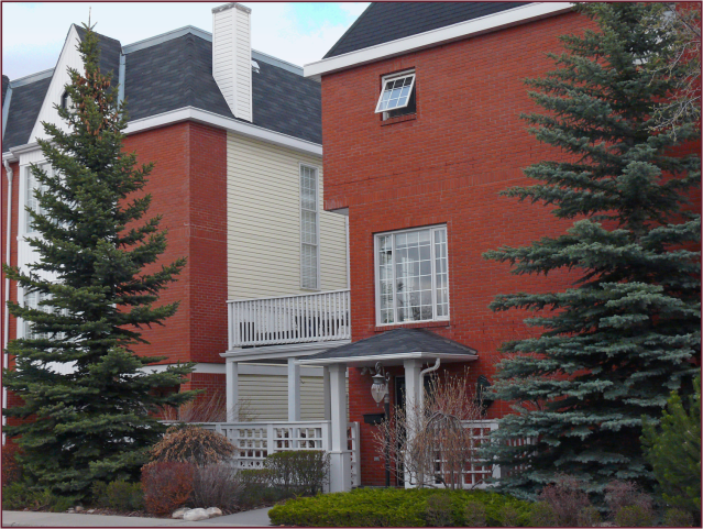
The other thing that happens is illustrated on the left. In the top example, the diorama represents an older home with plantings typical of the time it was built – Cotoneaster hedge, Potentilla, and little Johnny’s ‘Arbour Day’ tree, a Colorado spruce (Picea pungens). Not particularly inspired I realize, but at least it’s in scale with the house.  Fast forward a few decades and the scenario depicted in the bottom photo has likely ensued. Little Johnny is forty years old now and so is this landscape. I guess nobody took into account way back when, that living things don’t remain static. They grow … and grow and grow. So what was once in scale is no longer.

Gardeners, let’s remember to consider future size – the mature size of the plants we choose – and locate them accordingly.  Let’s not plant Colorado spruce or the even larger white spruce (Picea glauca), in our small urban yards. They are for acreages and parks, and maybe very large residential yards, but too big for any other urban application.

There are smaller evergreens much better suited to our gardens, for example Picea pungens ‘Bakeri’ (Baker’s blue spruce) or Pinus uncinata (mountain pine).

In my own neighbourhood I see tall cedars (likely cv. ‘Brandon’) – planted decades ago to frame the entrance of tiny bungalows – that now tower above them. In fairness to whomever planted them, I suspect the literature at the time may have advised that these Thuja species would top out at about 15 feet. Yeah right – gotta laugh when I hear people exclaim ‘cedars don’t do well in Calgary’.

I find this latter scenario (small house, big lot) to be more of a challenge than the reverse –precisely because there is often existing mature plant material that’s way too big, and homeowners are reluctant to part with it.  I don’t blame them. I have a huge Colorado blue spruce right in the middle of my back yard. Though we have a relatively large property, this mammoth evergreen has been difficult to design around. Every winter my husband and I contemplate removing it and every summer we remember why we, as of yet, haven’t done so – it provides much-needed shade from the late-day prairie sun. If you live on the prairies you’ll no doubt be aware, that our late-day sun can be hotter and more intense than our mid-day sun. So unless we decide to invest in central air conditioning, Mr. Spruce gets to stay.

The right side of this landscape is nicely in scale with the house. On the left side, a very large blue spruce precludes the possibility of correct scale for that area. It’s a lovely tree – healthy and very blue, so I understood why the clients wanted to keep it, but it typifies the design challenges of a mature neighbourhood. Photo: Sue Gaviller

If you’re planning a new landscape, or renovating your old landscape, remember to think about Scale. Then think like Goldilocks – you don’t want too big. Or too small. You want juuust right.

Til next time,
Sue
 
© Sue Gaviller and Not Another Gardening Blog 2012. Unauthorized use and/or duplication of this material without express and written permission from this blog’s author and/or owner is strictly prohibited. Excerpts and links may be used, provided that full and clear credit is given to Sue Gaviller and Not Another Gardening Blog with appropriate and specific direction to the original content.

Movin’ On – The Principled Gardener Part 6

A week or so ago, before our balmy fall weather morphed into an early blast of winter, I took a drive through a couple of our city’s more ‘distinguished’ neighbourhoods looking for photo-ops. As I scanned the tastefully landscaped homes, which were all the more attractive with the accompanying hues of autumn, I found myself stopping and starting, braking and rubbernecking to get a better look. Yes I was that nuisance driver you wanted to bellow at: “Get moving lady!”  “Move over lady!”  “Move lady!”

Move!

My car may not have been moving but my eye certainly was – well designed landscapes invite that. In fact Movement is one of the Design Principles and just happens to be the subject of this post (shameless segue I know). The definition is of course self-explanatory: Movement refers to what keeps the eye in motion throughout a landscape. Of course this visual movement will occur with or without our intervention, but design choices can definitely affect how our eye will move through a garden.

One of the ways we can generate movement is with rhythmic repetition. You’ll recall that I discussed repetition several months ago in reference to Unity. However, repetition as it relates to Movement refers to a design element that is repeated at regular intervals or in an obvious pattern. It can be a single element recurring regularly or a more complex pattern of alternating elements.

Rhythmic repetition of grafted Syringa meyeri standards reinforce movement along this uniquely curving fence. Photo: Sue Gaviller

Rhythmic repetition of grafted Syringa meyeri standards reinforce movement along this uniquely curving fence. Photo: Sue Gaviller

Picea pungens ‘Glauca Globosa’ & dwarf Pinus mugo alternate in front of the fence, and Populus tremula ‘Erecta’ & upright Picea pungens (unknown cv.) alternate behind the fence, creating effective rhythmic movement. The fence too has rhythm, due to the repeating brick pillars. Photo: Sue Gaviller

Repeating clumps of Calamagrostis acutiflora 'Karl Foerster' direct and reinforce movement in two directions. Photo: Sue Gaviller

Repeating clumps of Calamagrostis acutiflora ‘Karl Foerster’ direct and reinforce movement in two directions. Photo: Sue Gaviller

Straight lines = fast movement. Note how the eye shoots right back to the end of this path – likely the desired effect, i.e. the eye goes directly to the focal point at path’s end. Photo: Marny Estep

We can also affect movement with the design lines we choose. Straight lines, since they’re very direct, generate very fast, forceful movement. Angled lines, though still quite dynamic, are a little slower because they’re less direct – they move across our field of vision at the same time they’re moving with it. Curving lines create the slowest movement. Perhaps this gentle movement explains why curves are favoured by gardeners – a reprieve from our fast paced lives? Remember though that curves need to be big and bold if they’re to have this calming effect – too many small curves just feels busy.

The large curve of lawn space and the alternating blue and green junipers, create good flow and movement in this autumn landscape. Photo: Sue Gaviller

Movement can be affected by plant form as well. Rounded or mounding forms encourage movement – the eye just glides over them and moves on. Upright forms on the other hand, arrest the flow of movement – they literally interrupt our line of vision. For this reason they are useful in a long straight planting – the upright form acts as a visual stop to prevent the eye from reading the entire length at once. However, for this same reason, upright forms (especially very narrow ones) should be used sparingly or a ‘stop and start’ kind of movement results (a bit like my abovementioned driving).

The rhythmic repetition of clipped Buxus shrubs, in addition to their rounded form, creates nice movement along this walkway at Butchart Gardens, Victoria. Photo: Jane Reksten.

The large rounded forms of pruned Cotoneaster lucidus lead the eye to the upright pyramidal Picea pungens which abruptly halts visual movement. Photo: Pat Gaviller

So there you have it fellow gardeners – we’ve waded through yet another Design Principle. Moving on then….

 
Drive safe,
Sue
 
© Sue Gaviller and Not Another Gardening Blog 2012. Unauthorized use and/or duplication of this material without express and written permission from this blog’s author and/or owner is strictly prohibited. Excerpts and links may be used, provided that full and clear credit is given to Sue Gaviller and Not Another Gardening Blog with appropriate and specific direction to the original content.

A Question of Balance – The Principled Gardener Part 5

Life’s all about balance right? Well not all, but balance is vital to a happy healthy life – a balanced diet, work/life balance, even our ‘play time’ needs a balance of restful leisure vs. active recreation. My husband has been reminding me of this frequently of late: ‘Sue, you need more balance in your life – it’s not healthy to spend so many hours in front of your computer.’ Unfortunately, much of my work – designing, writing, preparing presentations, requires that I do just that. It seems the creative process may be good for the brain but not so good for the body. Hubby is right of course. I am however, better at bringing balance to a landscape composition than to my own life, so for now let’s deal with that.

Balance refers to a state of equilibrium – real or perceived.  Traditionally we think of balance in the landscape as being either symmetrical or asymmetrical, symmetry being elements arranged identically around a central axis, and asymmetry, when elements appear equally weighted but aren’t identically arranged.

Left: Symmetrya columnar tree and bird bath create a central axis with identical plantings on either side.
Right: Asymmetry – the mass of the larger shrub on the right is roughly equal to that of the 3 smaller shrubs on the left.

Though symmetry most often has a formal application, it has other uses that aren’t necessarily formal. For example, a long narrow space can benefit from the use of symmetry – the eye will always stop and rest at the centre point, often stopping there first before scanning the composition in either direction. This prevents viewing it in one uninterrupted scan. Symmetry is also appropriate for certain theme gardens, for example Colonial style gardens or Italian Renaissance style gardens.

Formal symmetrical design.

Symmetry is useful in a long straight planting, preventing the eye from reading the entire length in a single scan. Photo: Sue Gaviller

The Italian Renaissance garden at Hatley Park in Victoria B.C. is appropriately symmetrical. Photo: Jane Reksten

Asymmetry on the other hand, is more common than symmetry and is generally considered to be more informal in presentation. Ensuring proper balance in an asymmetrical design means planning your garden spaces in such a way that you can in fact create balanced plantings. If you’ve designed your yard with all or most of the planting space on one side of the yard and nothing but lawn on the other, then you simply won’t be able to bring balance to your landscape composition.

Asymmetrical landscape design

An asymmetrical design sometimes contains moments of symmetry – symmetry can be useful  in a corner planting to ‘anchor’ the corner, used around a focal point to help “stage” it, or at the deepest part of a curve.

Left: unbalanced asymmetrical design. Right: Balanced asymmetrical design – note the symmetry in the top right corner, anchoring it.

A brief moment of symmetry supports the dominant status of the bird bath. Photo: Sue Gaviller

Balance can be thought of in terms of more than just symmetry and asymmetry. There must also be balance of colour, weight and line. Okay what does that even mean? Well let’s look at colour – light colours draw the eye more than dark colours so to balance these, more of the darker colours need to be present. However, dark colours also appear more ‘weighty’ so their overuse can cause your garden to feel heavy. Colours of medium darkness then, should predominate – colours like green. Yup jus’ plain ol’ green. I’ve said it before and I’ll say it again – green should be the principal colour in your garden.  Bright colours too will draw the eye, so for the purpose of balance, muted colours need to outweigh vivid hues.

If we look at the concept of line, a vertical line (like that presented by an upright tree or tall grass), offers more visual punch than a horizontal line (such as that created by a mass of groundcover or low growing shrubs). Hence upright forms should be used as accents with lower forms predominating.

Balanced asymmetry - note the use of symmetry at the centre of this otherwise asymmetrical design. As well, the balance of colour, weight and line, creates a varied but balanced sight-line. Photo: Sue Gaviller

Balanced asymmetry – note the use of symmetry at the centre of this otherwise asymmetrical design. As well, the balance of colour, weight and line, creates a varied but balanced sight-line. Photo: Sue Gaviller

Ah yes, balance! Vital to both good health and good design – guess I better go find me some.

Yours in Good Health,
Sue
 
© Sue Gaviller and Not Another Gardening Blog 2012. Unauthorized use and/or duplication of this material without express and written permission from this blog’s author and/or owner is strictly prohibited. Excerpts and links may be used, provided that full and clear credit is given to Sue Gaviller and Not Another Gardening Blog with appropriate and specific direction to the original content.

The Principled Gardener Part 4 – Unity by Interconnection

Over the last several months I’ve been discussing the Design Principle of Unity and how it can be incorporated into our landscapes and gardens. We’ve looked at Unity by Repetition, Unity by Dominance and Unity of Three. Today I wrap up this discussion with a look at one last way we can create unity in our gardens, with the use of Interconnection.

Interconnection refers to the practice of connecting or physically joining all landscape elements and spaces. Now you’d think that since the definition of Unity is oneness, that the idea of interconnection or joining would be a no-brainer, but I have trouble convincing gardeners of this one. It’s certainly harder to achieve if the basic layout of your landscape is already in place, especially the hardscapes (patios, walkways, etc.), but if you have the opportunity to physically connect all your landscape spaces, the result is very pleasing. So what do I mean by this? Let’s look at the example below. In the image on the left, a number of different landscape features – a deck with a hot-tub, patio with a fire-pit, and kidney-shaped island beds – are all floating disconnected in a sea of lawn. This composition lacks interconnection. The image on the right includes the same landscape features but the spaces are now all linked together, hence this landscape has been unified through interconnection.

Left: landscape lacks unity. Right: landscape is unified through interconnection. Note how the lawn in the composition on the left, is ‘negative’ space, i.e. the space between the landscape elements. In the image on the right, the lawn has become a landscape element and the planting space is now the negative space.

What this means fellow gardeners, is – brace yourselves – no island beds. I suspect therein lies the gardener’s grievance with interconnection – we do love our island beds don’t we? But think about it, the word ‘island’ by definition means disconnected. Just to be clear though, this rule doesn’t apply to acreages where very large island plantings are often employed as spatial definers – perhaps to separate the landscaped area around the house, from the ‘back forty’.  In this case the plantings are large enough that the eye doesn’t experience them as islands, so unity isn’t compromised. Neither would it apply to botanical gardens, or show gardens – again the plantings are too large to be seen as island beds, and are planned in such a way as to facilitate foot traffic for maximum viewing potential.

Interconnection can also be utilized to unify an individual planting space – disparate groupings of trees, shrubs and perennials can be underplanted with a single type of groundcover or other low growing plant. This connecting plant material brings the dissimilar groups into relationship with each other, therefore unifying the whole planting composition.

A mass of Arctostaphylos uva-ursi (kinnickinnick) covers this entire bed thereby connecting the plant material and creating unity. Photo: Pat Gaviller

The idea of Interconnection is really underscored for me when I look at the evolution of my own garden. When we purchased our house almost 25 years ago, the only growing things in the front yard were two Cotoneaster shrubs, which the previous owner had tried in vain to kill, and a green ash tree, all of which were on city property. The only garden beds were small strips of soil against the foundation:

front yard 1

Over the next few years, I built upon these beds, first expanding the beds adjacent to the house and carving out a kidney-shaped bed around the ash tree:

front yard 2

A year or so later I decided to make the bed in front of the house a little curvier and I added a couple more island beds:

front yard 3

I kept adding and expanding until eventually it looked something like this:

front yard 4

I was never really happy with the design as a whole, even though each individual bed was nicely planted. When I’d stand back and try to take the whole thing in, what I saw was a bunch of scattered puzzle pieces – a disjointed picture, as if the puzzle was yet to be assembled. It wasn’t until I became a student of design that I discovered what the problem was; none of the beds were linked or touching, hence no interconnection = disunity. A number of years ago I decided to correct this and proceeded to join all of the beds.

front yard interconnected

It’s an improvement to be sure, but there are still flaws – a couple of acute angles which as you know is a design no-no. As well, due to the positioning of the sidewalk, the two sides are still unbalanced – but that’s a whole other story. In fact it’s a whole other design principle, that being the Principle of Balance which we’ll look at next month. Stay tuned.

Til next time,
Sue
 
© Sue Gaviller and Not Another Gardening Blog 2012. Unauthorized use and/or duplication of this material without express and written permission from this blog’s author and/or owner is strictly prohibited. Excerpts and links may be used, provided that full and clear credit is given to Sue Gaviller and Not Another Gardening Blog with appropriate and specific direction to the original content.